Top Ten Tuesday is a meme hosted by That Artsy Reader Girl, featuring a different top 10 theme each week. This week’s topic is Book Cover Freebie – meaning we come up with our own spin on the topic, so long as it relates to book covers.
I thought I’d keep it simple and highlight types of covers that I love… plus a couple that I loathe.
I LOVE:
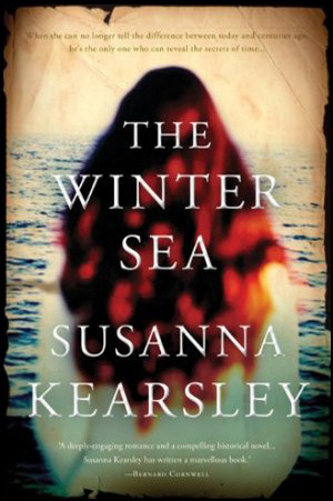
1. Covers featuring dreamy characters gazing out to sea — my favorite example being this lovely cover for The Winter Sea by Susanna Kearsley:
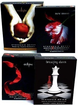
2. Bright colors on a black background: Maybe it became popular back with Twilight, but I’m always a sucker for the bright-on-black look.
3. Cutesy cartoon-y romance covers:


4. Cheesy 70s covers:


5. Moody urban fantasy heroes:


6. A series with a committed cover theme:


7. Bonkers looks for a bonkers book — such as these covers for books by Grady Hendrix:


8. Covers full of YUM — I’m not a foodie, but I do love a good cupcake!


And just a couple types of covers that I LOATHE:
9. Bare chests. Muscles. Tattoos. Muscle-y tattooed chests. You get what I mean.
[Note: Sorry — I started looking for images to go with this one, and I just couldn’t. For whatever reason, this type of cover makes me cringe SO much.]
10. Movie/TV tie-ins. I mean, I love a great adaptation as much as anyone, but I still prefer my book covers to be just book covers, not pictures of movie or TV stars. Even for my beloved Outlander series, I’d still take an old-fashioned cover over the new Jamie/Claire/TV cover (and don’t get me wrong, I adore the TV series!)


Are there certain types of covers that you love or loathe? Let me know what you think!
And if you wrote a TTT post this week, please share your link.

LOL, bare chests!! Ha ha, I hate those covers as well. I guess when I was younger I enjoyed them, but now they’re just annoying
I just find them such a turn-off!
I love your take on this week’s topic! 🖤 I don’t like characters faces on covers. I preferred to imagine how they look myself. And I totally agree don’t use the picture from the movie on books. The originals are perfectly fine :))
I agree about faces, usually. I’d rather imagine… although it also bugs me how so many books show half faces these days.
Great list! Yes, I love a series with a committed cover design – it’s so satisfying. Cheesy ’70s covers are so fun, too – I especially love fantasy covers from the ’70s and ’80s because they’re just so bad they’re good.
Yes, definitely some amazing fantasy and sci fi covers from the 70s! They’re so much fun.
Bare chests lol! They are totally overdone. I just hate when series change their covers, especially half way through.
Here’s my list for TTT
Absolutely agree! I can’t stand it when I buy books in a series and then the full set doesn’t match up.
I’m loving seeing everyone’s take on this weeks theme! I also love bright colours on black backgrounds, especially when they look sort of Russian (think The Bear in the Nightingale series!).
For my TTT I decided to find my favourite cover designs for three of my favourite heroine-led classics! https://talkingtomyshelf.wordpress.com/2020/01/28/top-ten-tuesday-covers-for-classic-female-heroines/
Mmm, I love The Bear & the Nightingale!
Very good post! Horrorstor–not my kind of book, but the cover DOES make me want to read it.
One of the best covers in recent years! It’s really the same size and dimension as an Ikea catalog. So well done!
A friend love IKEA and I mentioned the book. She bought it and had it on the table. Her mom thought it WAS the catalog–in Swedish! lol
That’s awesome!
Love the Amy Stewart book covers!
Such great covers! And the books themselves are great!
Thanks for sharing, very fun cover ideas. Which of these would you say is your favorite?
Oh boy, so hard to choose! I actually really love the urban fantasy books — the covers give such a good idea of the mood of the books.
I really like it when characters look out at the sea on book covers, too.
My TTT .
Maybe because I can imagine myself in their shoes…
I like romcom illustrated covers. It’s a new trend in romance I’m enjoying as of yet. And so agree with you on the Movie/TV series themed covers. So not my cup of tea. This is one area where HP has sort of won, among everything. I love the various editions they come up with, even though I do despair about not being able to own every single edition! 😂
Have a great reading week!
Here’s my TTT: https://saraabesukhan.com/top-ten-top-5-tuesday-favorite-book-covers-most-anticipated-2020-releases/
Do check if interested! 😊❤️
Are you trying to get every possible HP? That’s a big goal! I have a few different versions, but I’ve convinced myself that I should stop spending money on books that I already own… even though the house editions are so nice!!
Great post!! I absolutely hate movie tie-inn covers!!! I don’t quite know why but I will never buy them!
Top Ten Tuesday
Ugh, me either… not sure why the publishers feel the need to stick actors’ faces on my books!
I know!! It’s quite frustrating. I wonder if there are a lot of people that do love them.
Great list this week. Though I don’t read a ton of romance novels, the covers you featured are fun. I like the illustrated cover trend.
I’m with you on the movie/TV tie-in covers. I have kept two copies of the The Thorn Birds for years–one with the original cover and the other one with Richard Chamberlain and Rachel Ward. I hadn’t read the book before I saw the movie. Imagine my disappointment when I discovered Father Ralph looked nothing like Richard Chamberlain. 🙂
Ha ha, sometimes it can be hard to separate the book character from the TV character, especially for a classic like The Thorn Birds! I mean, I’ve read the Lord of the Rings books, but I can’t help it — Aragorn is Viggo Mortenson, no two ways about it!
I dislike movie tie-in covers too. Even when I like the movie, I just want the classic look, not to be reminded of the characters Hollywood (or whoever) cast in the roles that I initially imagined in my head. Even for something like Harry Potter, where by the time I got around to reading the books (still working my way through) the movie actors basically are those characters in my head, I prefer the non-movie covers.
I suppose the movie tie-ins are a way to draw people to the books who maybe wouldn’t normally read them… but I’m a purist when it comes to my covers, I guess! 🙂
I can see it that way. Plenty of people might be more willing to buy The Martian with Matt Damon on the cover instead of a faceless astronaut. But like you, I prefer the non-movie covers.
These are great, Lisa. Who can argue with cupcakes, right? As for the bare chest covers, I think they’re funny (but also so so cringey) and there are so many with the same type – not that I’m reading them!
I haven’t read all the cupcake books (just one, actually) — but I love checking out covers with delicious-looking baked goods. So tempting…
Love cupcake frosting 🙂
Yummmmm
I will forever be in love with the Twilight covers. They definitely started a trend. 😉
My TTT http://abookwanderer.com/top-ten-tuesday-book-covers-that-are-eerily-similar/
So true. And I never get tired of the look!
I’m a fan of bright colours on black backgrounds too and I’m not a fan of movie tie-ins either.
I’ve seen a couple of books on other blogs recently with really bright flowers on a black background and they were so pretty… but of course, I couldn’t remember what they were once I wanted them for this post. 🙂