
Top Ten Tuesday is a meme hosted by That Artsy Reader Girl, featuring a different top 10 theme each week. This week’s topic is Book Covers Featuring Cool/Pretty/Unique/etc. Typography, with the prompt Typography is the art of arranging letters so they look visually appealing and more interesting than, for example, the body text of this blog post you’re reading now.
I’m not always great at visuals and graphics (my artistic side is… let’s say… rather under-developed). Still, perusing my shelves, I was able to find books where the cover lettering feels different and really fits the theme or subject:


- Paperbacks From Hell by Grady Hendrix
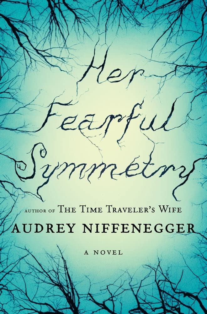
- Her Fearful Symmetry by Audrey Niffenegger
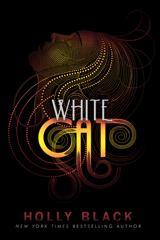
- White Cat by Holly Black
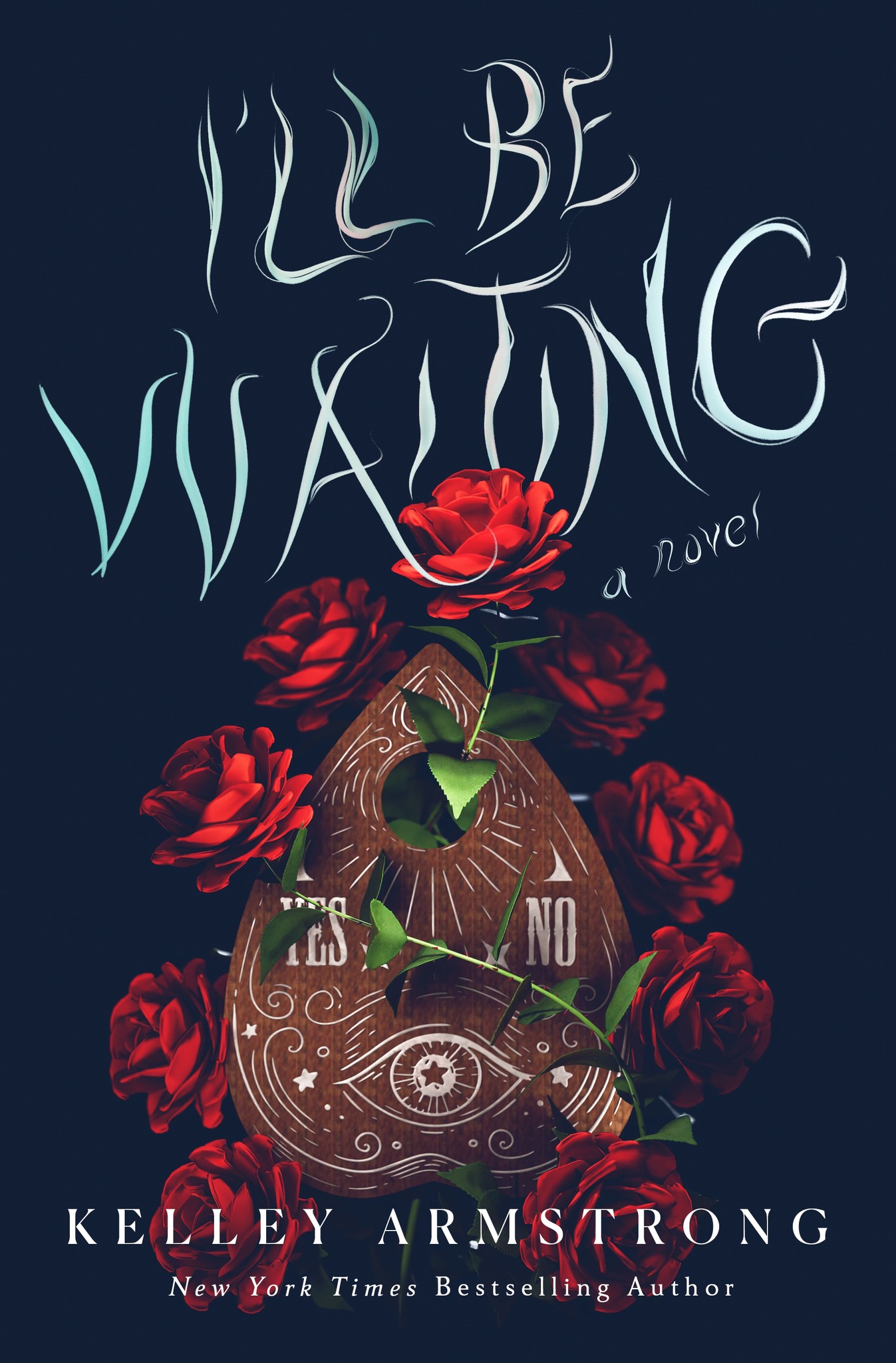
- I’ll Be Waiting by Kelley Armstrong
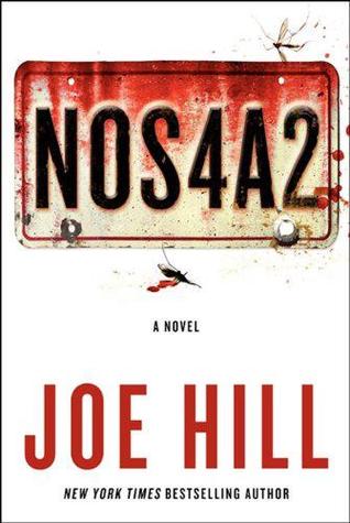
- NOS4A2 by Joe Hill
- You Suck by Christopher Moore
- Doll Bones by Holly Black
- Small Spaces by Katherine Arden
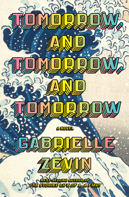
- Tomorrow, and Tomorrow, and Tomorrow by Gabrielle Zevin
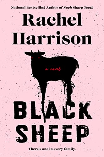
- Black Sheep by Rachel Harrison
I also have in mind a couple of series with iconic typography:

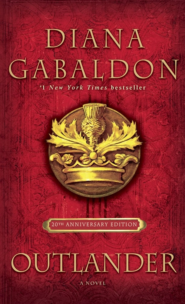
Can you think of any others, similar to Harry Potter and Outlander, where the font/typography is so strongly associated with the book series?
If you wrote a TTT post, please share your link!

You’ve got some great ones here!
Thank you!
Ooo I love the typography on Small Spaces!
If I remember correctly, all the books in that series have really great covers and typography!
I love the variety of clever type on book covers you found. Bite Me is my favorite.
I love the look of that one too!
Love the variety of typography you found! Bite Me is so fun, but I also love Her Fearful Symmetry. 😀
Definitely two of my favorites!
The font for Her Fearful Symmetry is HAUNTING! But also so captivating!
Happy Reading! ❤
It’s been a long time since I read Her Fearful Symmetry — but that cover and font totally fit the vibe!
Great selection! I love that cover of White Cat.
Isn’t it cool? The other two books in the series have similar style covers with different color patterns — they look so great together.
These are fantastic! I love NOS4A2, such a great cover, and Tomorrow and Tomorrow and Tomorrow is a favorite of mine😁
I love both of those too!
Lovely selections, thanks for sharing your #TTT
Thank you!
Omg I cant believe I never really took in the Harry Potter font before 🙈🙈 I’ve read the series so many times but somehow completely overlooked it. There are some great font usages here. I especially like the Joe Hill one, Her Fearful Symmetry & Small Spaces.
Thanks! I was surprised by how much fun this prompt turned out to be!
That WHITE CAT cover is stunning. The font is a tad hard for me to read, but still, I love it! Great picks.
Happy TTT (on a Thursday)!
Susan
http://www.blogginboutbooks.com
I’d practically forgotten about White Cat until I started looking through my shelves for this week’s list. I’ve had a copy for a long time, and I still haven’t read it! I think I’d better do something about that 🙂