
Top Ten Tuesday is a meme hosted by That Artsy Reader Girl, featuring a different top 10 theme each week. This week’s topic is Cover Redesigns I Loved/Hated — which at first I wasn’t going to do, but then I took another look at my shelves, and found last-minute inspiration! Here are a variety of books that have been redesigned over the years. You be the judge of whether it’s for better or worse!
And because I’m running late, my top 10 list is really a top 5 list this week. Short & sweet!
1. Wuthering Heights: This just makes me laugh. In the heat of Twilight mania, this classic was reissued and blurbed as Bella’s favorite book. I couldn’t help but feel sorry for the tweens who picked up a copy expecting vampires!


2. Stephen King books: I was always kind of partial to the cheesy early paperback editions of Stephen King’s books. The more streamlined graphic covers don’t have the same scare factor for me:


3. John Scalzi books: A few early Scalzi novels have been issued with new covers this past year. The new ones are nice, but you just can’t beat the whimsy of the earlier version.


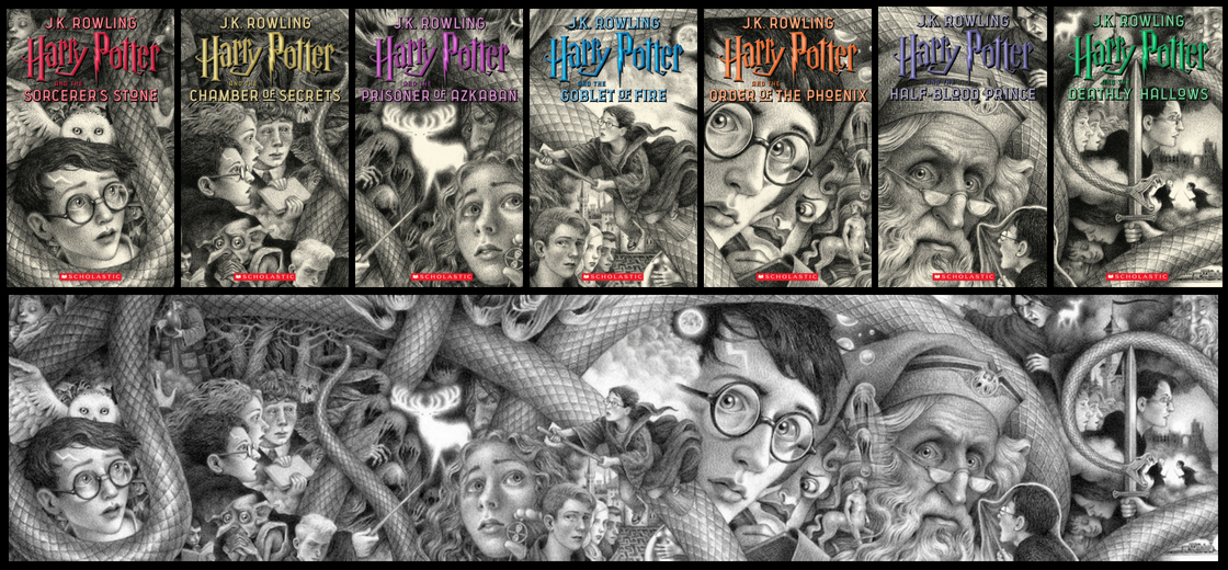
4. Harry Potter: Okay, yes, the original is an absolute classic… but I do think Brian Selznick did a fantastic version with his set too.
5. Outlander: Some of the early covers in the series are so old-time cheesy, they just make me laugh!


How do you feel about cover redesigns? Are there any that you particularly love or hate?
If you wrote a TTT post this week, please share your link!

I can’t stop giggling at that Wuthering Heights cover. It’s lovely….but it’s totally not a vampire romance novel in any way. LOL. I wonder how many tweens or teens liked it despite the misleading message on it?
My TTT.
It just cracks me up. The marketing team was definitely thinking outside the box. 🙂
I definitely prefer the It with the smile and clown nose. I think that represents the book the most. However, I’m pretty partial to the one with the sewer and the boat after watching the new movie, because wow, that scene sticks with you xD I LOVE the Selznick covers, and it’s so freaking neat that you can put them together into a mural. I love little things like that about covers.
Here’s my TTT post.
I love the Selznick set! That was a special gift I gave myself. 🙂 I’m pretty sure the first time I came across It as a book was with the sewer picture… so incredibly creepy.
Great selection and evolution of book covers.
Made me curious about how much impact the cover has on book sales or its commercial success?
I’ve never seen that Wuthering Heights redo, if it weren’t for the tagline, it wouldn’t be half bad!
It’s certainly more dramatic than the old-fashioned classic covers!
I can’t believe they wrote “Bella & Edward’s Favorite” on Wurthering Heights 😂😂 Thats awesome
Isn’t that hilarious? I’m still not over it.
Great list! Those Brian Selznick editions of the Harry Potter books are beautiful. ❤
They really are! I always love his drawings, and these are so special.
Yikes, that Wuthering Heights cover! Painful. I think it’s safe to say Heathcliff would not be a fan of comparisons to Twilight
Ha ha, poor Heathcliff!
Oh wow, I haven’t seen the old Outlander editions before! They’re amazingly cheesy, I love it. And I love that there’s a bit of tartan cloth on each cover, just in case anyone forgot that the books are set in Scotland. 😀
I think I have a physical copy of at least one of these, and there’s a really horrible set of cheesy illustrations of the characters on an inside flap. Now I have to find it!
You can’t unseen that Twighlight W Heights, can you? Despicable lol
I just think it’s so funny. Thank goodness it’s a phase whose time has passed. 🙂