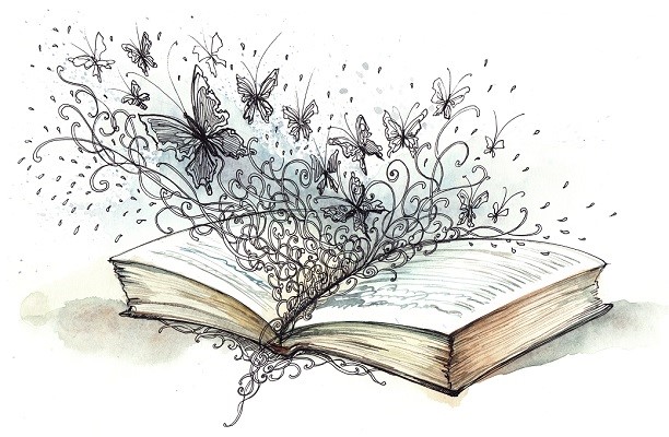

Switching things up a bit this week…
Usually, I participate in Top Ten Tuesday hosted by The Broke and The Bookish… but for this week’s topic, I mostly drew a blank. So, I thought I’d do a two-fer post: Two memes for the price of one! (Hey, don’t worry! There’s no cover charge on Tuesdays… )
First up, for Top Ten Tuesday: The topic is Top Ten Covers I Wish I Could Redesign. I couldn’t come up with more than five, so here’s my abbreviated list:
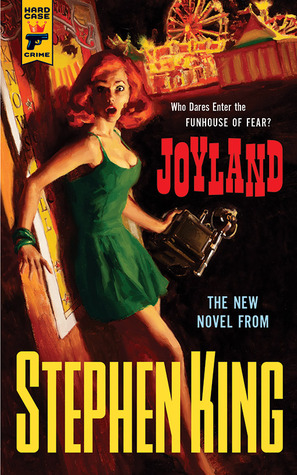
1) Joyland by Stephen King: As I said in my review, this cover really bears almost no relation to the content or the tone of Joyland, which is — for me, anyway — a nostalgic look book at a special summer, in which the main character unravels a murder mystery but more importantly does some serious growing up. Here’s the real cover, on the left:
 And on the right,
  here is my not-terribly-artistic attempt at something that better captures the mood of the book. (Pretend someone with actual design skills made this, and use heaping doses of imagination):
2 & 3 & 4) Harry Potter and the Sorcerer’s Stone, Harry Potter and the Chamber of Secrets, and Harry Potter and the Prisoner of Azkaban: I love the Harry Potter series so very much… but seriously, the cover art on the first three books makes Harry look so dorky!


From Goblet of Fire onward, Harry looks much cuter and cooler. I mean, I love him no matter what — but I was much happier with the cover art for books 4 – 7!
5) The Uninvited Guests by Sadie Jones:

When I checked this book out of the library, I expected — based on the cover and the synopsis — something a bit Downton Abbey-ish.
But no. The book is a weird muddle of a comedy of manners and a ghost story, and perhaps it’s just because my expectations were so far off, but it didn’t work for me at all (Read my review, here, if you want to know more!) Give this book a spooky or sinister image on the cover, and maybe it would have worked out. Truth in advertising, people!
♥♥♥♥♥♥♥♥♥♥♥♥♥♥♥♥♥♥♥♥♥♥♥♥♥♥♥
And for my second Tuesday book meme, it’s Teaser Tuesday!

Teaser Tuesday is hosted by MizB at Should Be Reading, and here’s how it works:
• Grab your current read
• Open to a random page
• Share a few “teaser” sentences from somewhere on that page
• Link up over at Should Be Reading!
My teaser this Tuesday are from Just One Day by Gayle Forman:
On the ride back to Utrecht, I call Agnethe the Dane to see if Lulu sent her any photographs, if there had been any correspondence. but she hardly remembers who I am. It’s depressing. This day, so seared in my memory, is just another day to everyone else. And in any case, it was just one day, and it’s over now.
Do you have a top 10 list or a teaser to share this Tuesday? Leave your link in the comments and I’ll be sure to come check out your blog! Thanks for visiting Bookshelf Fantasies… and have a great Tuesday!

I don’t really mind HP covers, I prefer these to UK ones, but it could be better. I have the first book with US cover (Slovenian translation), but all English ones, entire series, I have in Adult. I love those.
I really dislike Joyland’s cover, so weird, what you did looks so much better! I’d pick that up in a store. 😉
Ha, thanks! I guess I’d like the Joyland cover art if it matched the story at all, but it really doesn’t. I like the “adult” UK HP covers myself, although they do make the books seem so much more serious.
Harry does tend to come off as way to dorkish and a little too happy on those covers. I liked the teaser 🙂
My TTT
Thanks! I mean, I love Harry to pieces… but just not the covers. 🙂
The cover of Joyland is really bad! Great choices and intriguing teaser!
Thanks! It was hard to come up with a list of 10 this week — which was frustrating, because I know there have been many times I’ve had a negative reaction to a book cover. Just couldn’t think of any when it counted!
Oh thank goodness I’m not the only one with something against the Harry Potter covers!
🙂 You’re not alone!! I do really like the new set of covers, but I can’t really justify buying myself even more copies of HP.
I think the other cover for <i.The Uninvited Guests–it’s of an empty room of a cottage of some sorts–might’ve been more reflective of the story. Have yet to read it myself and though it didn’t match the content, that edition cover looks rather nice 🙂
My TTT
I think I just found the one you mean — sort of an empty attic with a woman’s shadow on the wall? Yes, that might have worked better for me, and might also have left me with a better impression of the book overall. The cover I had is very pretty — it just doesn’t really reflect the story at all.
I love the new HP covers that came out earlier this year so much more than the originals. I can’t help it! They’re so pretty and shiny!
Oh, I agree! The new covers are great. I was SO tempted to buy myself the new boxed set — except we must have at least 4 sets of HP floating around my house already, so I couldn’t really justify it. Yet. 🙂
that’s a great teaser, I do want to know more about the story. I enjoyed your top ten as well. kelley—the road goes ever ever on
I’m really enjoying Just One Year (about half-way through at this point). Have you read the 1st book, Just One Day? If you like contemporary YA, I’d recommend it!
I haven’t even read Joyland yet, but frankly I would’ve been much more apt to read it if it had the cover you designed. Anyhoo, here’s my Teaser Tuesday.
Aw, thanks! My design skills are laughable, but it’s the thought that counts! 🙂 Joyland is really a very good book, so if you have a chance, I really do recommend it.
I kinda agree on the Harry Potters- I have not read the series but plan to soon, but I have to say as popular as they are, the covers never appealed to me much. I know the cover should’t matter, but sometimes it does if I’m on the fence…
Now the new ones which I saw recently at Barnes and Noble just seemed so much more mysterious, and more fantasy-ish maybe, I don’t know. I definetly wanted to pick those up!
Well… I do like the new covers very much, and if I don’t already have SO many copies of the HP books in my house, I might seriously consider buying the new set too! Covers aside, this series deserves all the insane hype. I love these books immensely, and really hope you give them a try! Thanks for stopping by! 🙂
Love your teaser, Lisa! I enjoyed Just One Year so much, and the quote you chose is so true for real life as well! A moment that is special and important for us is just normal and barely a blip on the radar for other people.
Happy reading 🙂
Thanks, Lexxie! I think you’ve really identified why I like this passage so much! I just finished Just One Year late last night, and I’m still thinking about it quite a bit, but I really enjoyed it too.
I love the look of the Joyland cover, but I haven’t read the book. A cover that has little resemblance to the story is a pet peeve of mine, too, and I love what you did with your redesign!
I don’t care for those HP covers, either. I recently decided to buy a set, and I looked at all of the US and foreign versions that were available. I ended up buying the ones with the predominantly white covers from Scholastic UK, and they are so pretty and elegant.
Stephanie @ Inspiring Insomnia
Thanks! I agree that the Joyland cover is pretty cool — my complaint is about how it doesn’t relate to the story, which is a pet peeve of mine too! Ooh, white HP covers? I’m going to have to look those up!